The problem
Information about the festival is scattered across multiple
platforms. Our goal was to create a solution that is accessible
for young people, captivates their attention, sparks interest for
the festival and displays essential information primarily far
participating bands. The design needed to be vibrant and
reflective of the event's atmosphere.
Our solution
During the four weeks assigned for the project, following the
design process (user research, ideation, prototyping, testing)
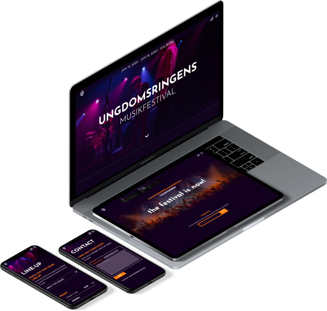
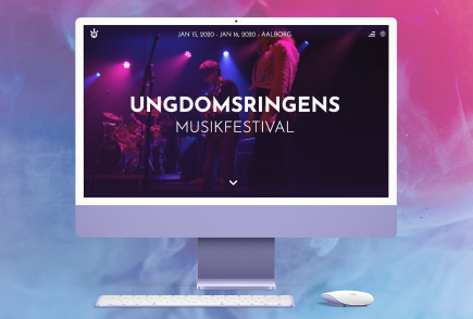
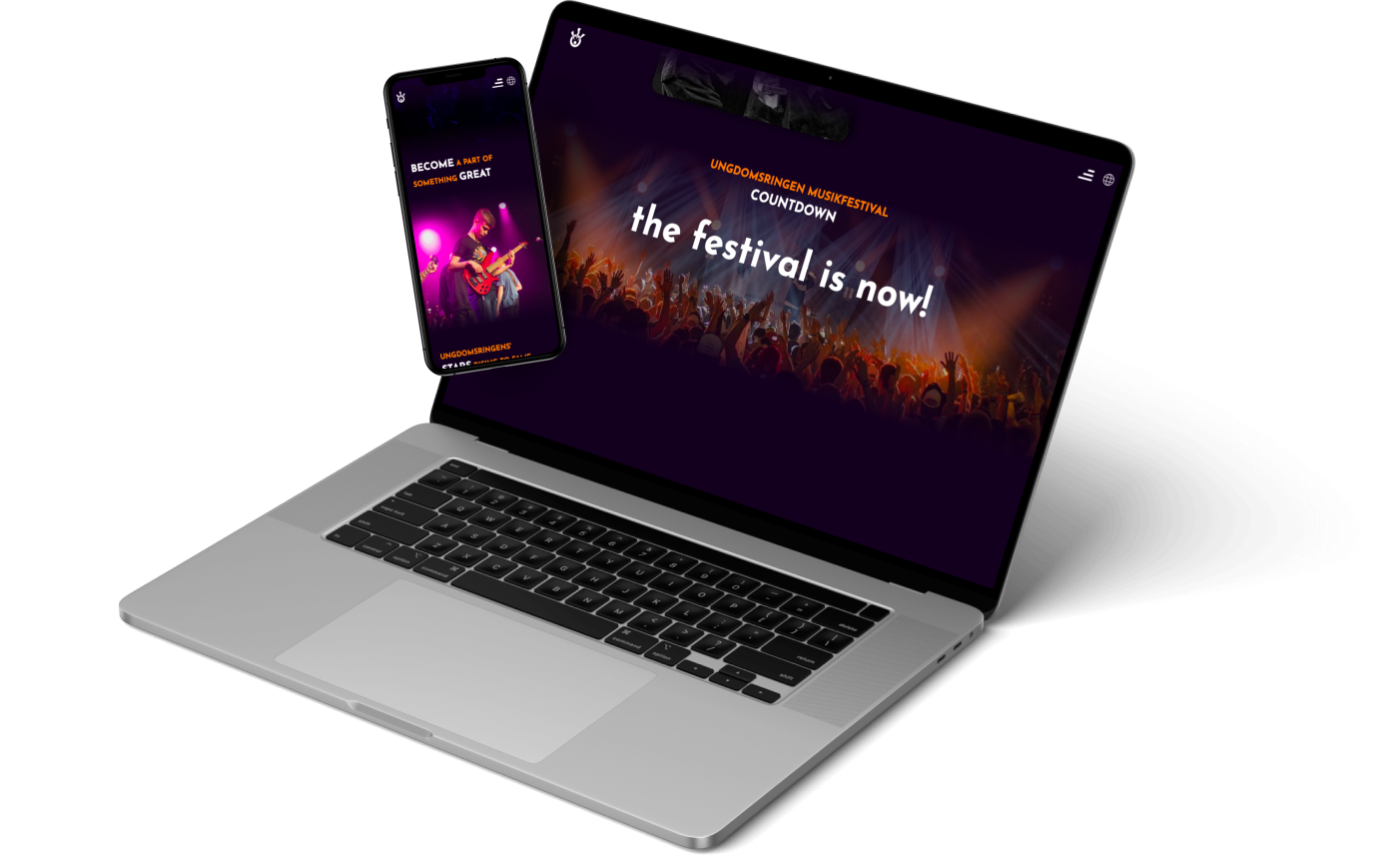
we created a fully functional, responsive website, where young
people are able to find information about Ungdomsringens
Musikfestival 2021. By using Wordpress, parts of the website's
content were made dynamic. The task provided some
challenges due to the young age of our users. To
accommodate their short attention span and to reduce time
reading through text, in our solution we used icons and
images, where possible.
Process summary
We worked with a range of user research methods in order to best understand users’ needs. In the
process, we used insights gained from a number of user interviews to create personas.
Next step was to go through the iterative process of ideating, sketching, wireframing, prototyping,
and testing.
The user personas were then used to simulate potential users’ interactions with our prototype.
The end-goal was to create a user-friendly, highly functional website, written in clean,
maintainable code.

User research
Following the client brief, we set out to gather more
information on competitors in the field of youth music
festivals. We looked around on the web and did
some benchmarking among different youth music festivals.
We noticed some common design patterns and practices, which we
decided to include on our website.
We also did a content inventory across various
platforms, to collect and condense scattered bits of information
about Ungdomsringens Musikfestival. All of this was later used in establishing the information
architecture. To expand on the existing information, we needed to find a way to better understand
our potential users.
Standard data
For standard data we used official reports published on the websites of different ministries. This
helped us to learn about
the Danish youth's use of technology and social media.
For the qualitative, semi-structured interviews we created a
guide, where set out to examine our hypothesis: People
attending music festivals consider the atmosphere and the
music/bands playing equally important.
With our research we aimed to figure out the motivations and
expectations of young people attending music festivals.
Structuring the information
Using already existing content from Ungdomsringen, we kept
in mind that our main target group was young musicians
planning to perform at the festival. When constructing the
navigation for the site, we wanted to keep the most important
and relevant information right at hand.
Design
Our goal was ease of use, and fast navigation between the features in our app. To facilitate this
goal, we made use of a selection of design patterns, such as large countdown, tables, and cards.
This ensured users would quickly adapt to the interface and understand it from the get-go. As the
lead designer I was in charge of overseeing the ideation process and creating the mockups. The
visual design had to be consistent with the diabetes.dk website.
Putting it all together
During production our team faced challenges as a
consequence the covid-19 lock down, We were forced to
work together remotely, far the first time. By focusing on
effective communication, and making the most of GitHub, we
quickly adjusted to the new and unusual situation, the
product was successfully delivered on time. As a novelty we
got to explore the habits and characteristics of a young user
group.
This project made clear for us the crucial importance Of the
lower levels of the five OX planes.
The website effectively gathers previously scattered
information, framing It in an accessible manner. displaying it
with a fresh and youthful 100k.
